Wednesday, 7 May 2014

The Making of the Music Magazine Front Cover

First I decided I would call the magazine "Damage".
I then found a font I liked using Photoshop CS6 and then went about deciding how to stylize the logo to make it recognisable when put next to other logos. I experimented with these ideas:
After deciding upon the the last way, I then went about adding effects to the logo.
I liked the look of the second font, as the faded colour and textured font seemed to reflect the attitude of an alternate rock/metal magazine. I then put this masthead onto a background to see how it would look.
  

After doing so, I saw that the masthead didn't show up very well on this background. I thought I should change the colour of the masthead and, at the same time try a background with a more subtle texture to it with a graduated tint towards the right hand side of the page (as this is where I want a majority of the cover lines to go).
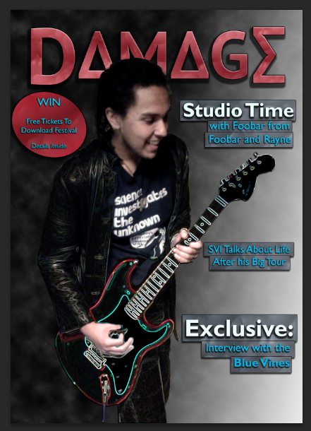
Once I was satisfied with this, I then added a feature photo, which I layered with a filtered copy of itself over the top and carefully removed parts of the filtered image (using the Glowing Edges filter from Photoshop's filter gallery) so that it was only the models clothing and the guitar that were filtered (the lefthand image is the original one, the righthand image is the original layered with the filtered copy).
At this point I decided to add in cover lines and a pug, as there is still a great deal of blank space on the page and a competition would help boost the magazines sales (as shown from my research). I opted to add banners behind the cover lines to make them stand off the background.
The final thing I wanted to add to this cover to really complete it was a barcode in the left hand corner with the date of the issue and the price (£3.79, between £3 and £4 to fit with what I researched).


Tuesday, 6 May 2014

Music Magazine Photos

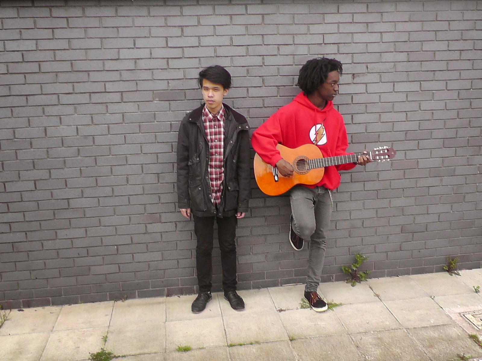
Here are the photos I took for my music magazine front cover, contents and double page spread.


Monday, 5 May 2014

Music Magazine Double Page Spread Research

Again, as with the front cover and contents page, I analysed some double page spreads to see what I need to include in my own in order for it to be successful.
Both of these double page spreads include a quote (that takes up a large amount of the page), a feature photo (that also takes up a large proportion of the image), a brief sentence to sum up the article and of course, the actual article itself. Generally the background of these spreads are quite barren of colour, with colour being provided by the feature photo and coloured text, which is used to highlight specific words in the quote or topic sentence.

Music Magazine Contents Page Research

As with the research for the front cover, I decided to analyse some contents pages to find conventions. This time I decided to look at the 2 magazines I decided to use as examples for my own, NME and Kerrang!
There's a clear heading in both that at least indicate that the page is in fact the contents page. In both cases, a fair portion of the page is text, with a lot of the text being in a different colour depending on it's importance (for example, how I have annotated the colour scheme on the Kerrang! Contents page).

Music Magazine Front Cover Research

In order to see what are considered conventions for the front cover of a music magazine, I decided to analyse some (including an issue of NME, which will be what I use as an example to base my own work from with magazines that aren't the same genre for comparison to see if other codes and conventions are present in those that aren't in NME).


It is noteworthy that 2 of the 3 magazine covers have feature photos that cover the masthead. Generally the masthead is bold at the top of the page and very little of the page is blank space. A majority is filled with the strap line (a short phrase used to describe or promote the magazine, which in fact, is not present on these covers), cover lines (brief sentences across the cover that give information on articles inside the magazine), banners or pugs (shapes, usually at the sides of the magazine that attract attention to something, usually a free gift or competition in the magazine. 

Music Magazine Survey Results

   After handing my survey to 50 people, I gathered the results to find what my demographic was and to see what would be appropriate to include in the magazine.
   The results showed that 90% of the people I had given the survey to were male and a majority were 15-20. This shows that the demographic that my magazine should be aimed towards are teenage and young adult males.
   Of the people that actually bought magazines, there was nearly an even split between Kerrang! and NME, with only 4% choosing the other options, so I should use Kerrang! and NME as references in my research of popular magazines. The reason for these magazines, 56% of the time was Bands/artists featured and 28% was Layout of the magazine.
   For the costs of the magazine a majority answered £3-£4, showing the magazine should have a certain level of quality in the printing, but not too expensive, so it's still accessible to a lower and middle class audience.
   The types of articles read were interviews (42%), features (30%) and news (28%). This means I should at least try to include an article from all 3 on the contents page and the best option for the double page spread would be an interview.
   The majority prefer their magazines to contain competitions.

Thursday, 1 May 2014

Music Magazine Survey

In order to gather information about what kind of magazine would appeal to the public, I devised the survey shown below.