I then found a font I liked using Photoshop CS6 and then went about deciding how to stylize the logo to make it recognisable when put next to other logos. I experimented with these ideas:
After deciding upon the the last way, I then went about adding effects to the logo.
I liked the look of the second font, as the faded colour and textured font seemed to reflect the attitude of an alternate rock/metal magazine. I then put this masthead onto a background to see how it would look.
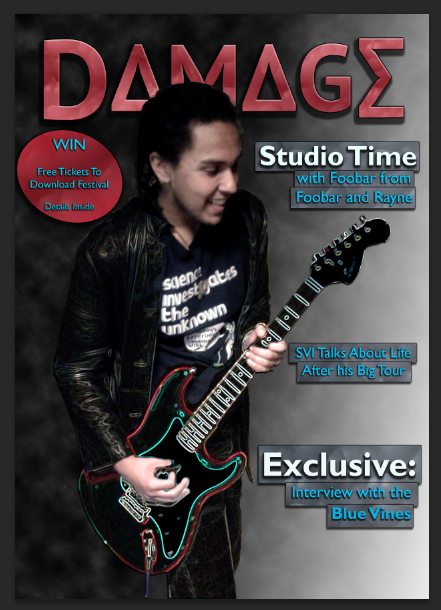
Once I was satisfied with this, I then added a feature photo, which I layered with a filtered copy of itself over the top and carefully removed parts of the filtered image (using the Glowing Edges filter from Photoshop's filter gallery) so that it was only the models clothing and the guitar that were filtered (the lefthand image is the original one, the righthand image is the original layered with the filtered copy).
At this point I decided to add in cover lines and a pug, as there is still a great deal of blank space on the page and a competition would help boost the magazines sales (as shown from my research). I opted to add banners behind the cover lines to make them stand off the background.
The final thing I wanted to add to this cover to really complete it was a barcode in the left hand corner with the date of the issue and the price (£3.79, between £3 and £4 to fit with what I researched).


No comments:
Post a Comment