Media Studies
Tuesday, 13 May 2014
Music Magazine Final Products
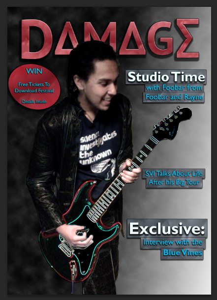
After looking over my drafts, I decided some changes had to be made.
After reviewing my cover, I decided there was too much space, so I moved the barcode to the bottom right corner and added another cover line.
The contents page looked too structured and predictable, so I decided to move the images around, cropping out the background from one of the images. I also removed the strip and made the entire contents have the graduated tint that was on the title strip.
The main issue with my initial double page spread was that the text wasn't legible (i.e the blue text on a green background), so I decided to duplicate the background layer and put a layer with a lower opacity (around 50%) and erased the initial background to make the quote and text from the article stand out more on the page.
Monday, 12 May 2014
Friday, 9 May 2014
The Making of the Music Magazine Double Page Spread
As with the cover and contents, the double page spread was created with Adobe Photoshop CS6.
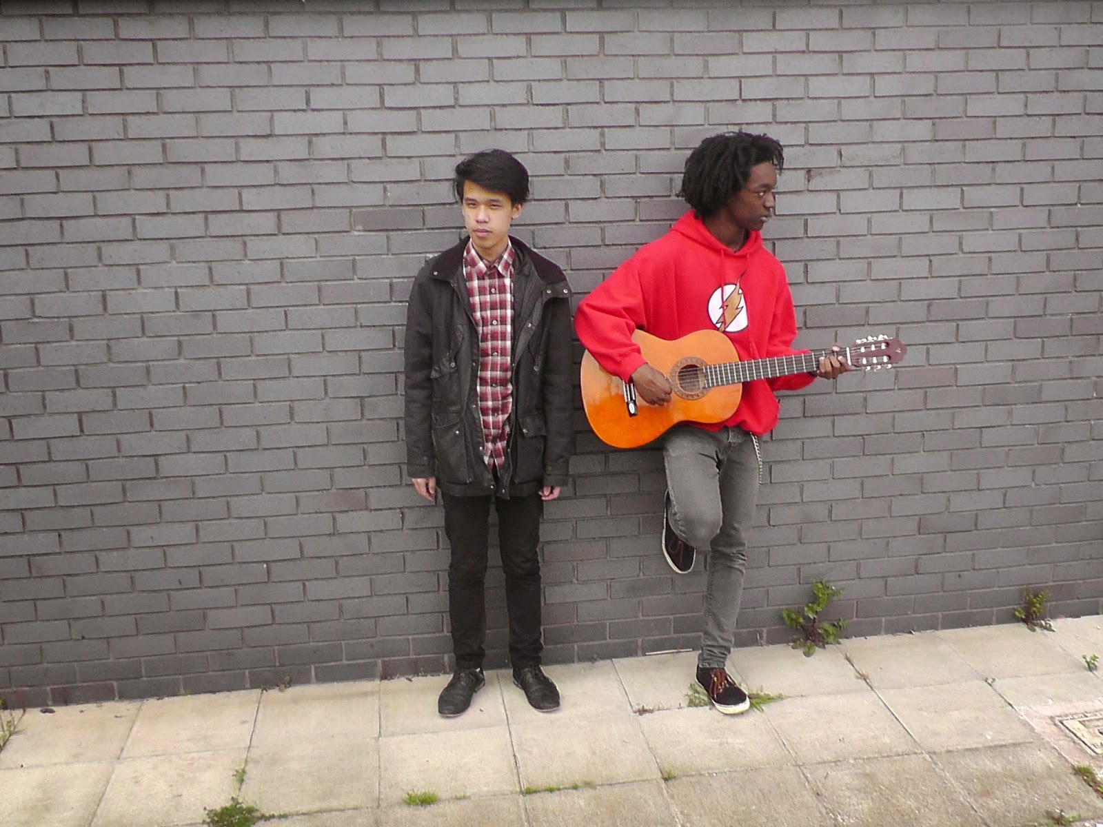
I began with an image and cropped out a house in the background, as that didn't give off the image I was going for in the photo. As a result of this I had to remove the sky from the image too. I then took a filtered copy of the image and erased most of it, leaving just the grass and parts of the plant in the background, as it created a shadow effect. I then created another copy and cropped out the models in the photo. I then added subtle stroke, inner glow and drop shadow effects to make them stand out against the rest of the image.
I began with an image and cropped out a house in the background, as that didn't give off the image I was going for in the photo. As a result of this I had to remove the sky from the image too. I then took a filtered copy of the image and erased most of it, leaving just the grass and parts of the plant in the background, as it created a shadow effect. I then created another copy and cropped out the models in the photo. I then added subtle stroke, inner glow and drop shadow effects to make them stand out against the rest of the image.
The blank edges of the image now seemed unnatural, so I added a rectangle behind (which is in the layers bar on the screenshot above) to make an artificial clear sky. I also added a simple title, "Meet the Blue Vines", in order to introduce the band.
At this point I decided I would add in a topic sentence to help introduce the article, as it is a Q&A styled interview, the sentence helps ease readers into the Q&A. I also decided I would use the quote "We just want to watch the world burn".
At this point, all I had left to add was the actual article itself. I put the text onto the background and decided that the questions should be a different colour from the answers. I also made sure that the text would be legible by adding a black rectangle behind the text and reducing its opacity to 15%, so that it only just masked the picture enough to leave the text legible.
Thursday, 8 May 2014
The Making of the Music Magazine Contents Page
As with the front cover, I made this in Photoshop CS6.
With the contents page, I decided I would begin with a title (simply, "Contents") in a strip across the top of the page. The title would be in the same font as the masthead, so the strip must be a colour that isn't red (so the text can be the same recognisable red with the texture as the masthead was).
With the contents page, I decided I would begin with a title (simply, "Contents") in a strip across the top of the page. The title would be in the same font as the masthead, so the strip must be a colour that isn't red (so the text can be the same recognisable red with the texture as the masthead was).
From here, I then added the images I decided I would used. For one image, I cropped out the background, as it didn't seem to fit with the rest of the contents page. For all the images, I added a subtly stroke effect to make them "stand off" the page slightly.
From here I decided to caption each image with their page number and a brief sentence about what the article covers. I placed a caption over the image I decided to relate to the double page spread that reads "EXCLUSIVE" just as I had a cover line that said exclusive across it.
Having captioned the images and laying them out how I wanted them, I decided to start adding in contents, using the 3 headings I had decided on in the research stage; Features, News and Interviews. I also added a small pug-like feature telling readers where to find the competition to make it convenient for readers.
Wednesday, 7 May 2014
The Making of the Music Magazine Front Cover
First I decided I would call the magazine "Damage".
I then found a font I liked using Photoshop CS6 and then went about deciding how to stylize the logo to make it recognisable when put next to other logos. I experimented with these ideas:
After doing so, I saw that the masthead didn't show up very well on this background. I thought I should change the colour of the masthead and, at the same time try a background with a more subtle texture to it with a graduated tint towards the right hand side of the page (as this is where I want a majority of the cover lines to go).
I then found a font I liked using Photoshop CS6 and then went about deciding how to stylize the logo to make it recognisable when put next to other logos. I experimented with these ideas:
After deciding upon the the last way, I then went about adding effects to the logo.
I liked the look of the second font, as the faded colour and textured font seemed to reflect the attitude of an alternate rock/metal magazine. I then put this masthead onto a background to see how it would look.
Once I was satisfied with this, I then added a feature photo, which I layered with a filtered copy of itself over the top and carefully removed parts of the filtered image (using the Glowing Edges filter from Photoshop's filter gallery) so that it was only the models clothing and the guitar that were filtered (the lefthand image is the original one, the righthand image is the original layered with the filtered copy).
At this point I decided to add in cover lines and a pug, as there is still a great deal of blank space on the page and a competition would help boost the magazines sales (as shown from my research). I opted to add banners behind the cover lines to make them stand off the background.
The final thing I wanted to add to this cover to really complete it was a barcode in the left hand corner with the date of the issue and the price (£3.79, between £3 and £4 to fit with what I researched).
Tuesday, 6 May 2014
Subscribe to:
Comments (Atom)


